
2023 On the Surface, 2018 Underneath
The strongest argument for comparing today's market to 2023 is also its most visible one. Looking beyond the headline index reveals a market shaped by rising rates, weakening participation, and macro forces that resemble a very different chapter of market history.
1. Purpose
This report tests whether the market of 2026 YTD (January to September) resembles 2023, the usual reference for a narrow, mega-cap-led market, or 2018, a year of rising rates, a strong dollar and a sharp fourth-quarter sell-off. It looks at rates and inflation pressure, breadth and small caps, the leadership of five groups (Mag7, defense, metals, financials and healthcare), and the indicators that marked the turning points in both earlier years. The Mag7 basket is an equal-weight basket of Apple, Microsoft, Nvidia, Alphabet, Amazon, Meta and Tesla. Defense is measured by the ITA ETF, financials by XLF, healthcare by XLV and metals by a metals basket. Small caps are measured by IWM and the average stock by the equal-weight S&P 500 (RSP).
2. Summary
On the surface 2026 YTD resembles 2023: the average stock has lagged the index and both small caps and the equal-weight index sit at historically weak relative levels. Underneath, the conditions are largely reversed. Long-term yields are rising to their highest level in 20 years rather than falling, the yield curve is positive and steepening rather than inverted, commodities have surged, and the dollar has strengthened. There is no 2023-style Mag7 engine; leadership is scattered.
2018 is the closer match, but mainly in the second half. In the first half the main difference is the Mag7, which led in 2018 and lagged in 2026. The recent months, however, closely resemble July to September 2018: small caps rolling over after a late-June peak, healthcare leading, financials lagging, and long-term yields and the dollar near their highs for the year. In 2018 that setup preceded the fourth-quarter sell-off. The key difference is the bond market: the curve was flattening then and is steepening now, and long yields have not yet peaked. In both 2018 and 2023 the market turned only after they did. Valuations have also fallen YTD, from 22.0 to about 19.2 times expected earnings, but through surging earnings rather than falling prices, which is the opposite of how they fell in late 2018.
3. Rates and inflation pressure
The three years had very different rate backdrops. In 2023 the Fed held short rates high, so the curve stayed inverted, and long yields peaked in October and then fell. In 2018 the Fed was hiking, so short rates rose faster than long rates and the curve flattened. Now short rates have risen only about half a point this year while the 10-year has risen by more than a full point, to its highest in nearly 20 years.
Unlike 2018 and 2023, it has not peaked yet. Over the past year the rise has come from the real yield, driven by Fed hikes and heavy bond supply, not from higher inflation expectations. The curve has steepened YTD from about +0.7 to +1.3 points because long yields are rising, which means investors are demanding more to hold long-term bonds, indirectly signaling a credit spread risk.
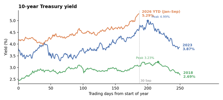
How to read: each line tracks the 10-year yield through one year, aligned by trading day. 2018 and 2023 show the full year, while 2026 is year to date (YTD), running to 30 September (dotted line). In 2018 and 2023 the yield peaked late in the year and then fell, and both turns came after that peak. In 2026 YTD it is still climbing and ends September at its high.
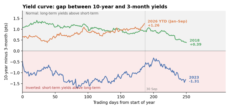
How to read: the line shows the 10-year yield minus the 3-month yield. Above zero (grey) is a normal curve; below zero (red) is inverted. 2023 was inverted all year. 2018 was positive but narrowing as short rates rose. 2026 YTD started at about +0.7 and has widened, because long-term yields are rising faster than short-term ones.
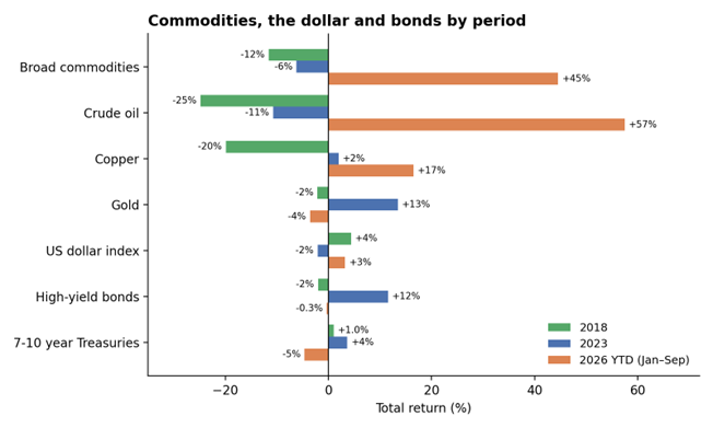
Commodities mark the sharpest break from both earlier years. They fell in 2018 and 2023 but are up more than 40% YTD, led by crude oil (up about 57%) and copper (up about 17%). The gains are uneven: crude peaked in April and swung widely, and gold and silver have been falling since late January, leaving gold slightly down YTD. The dollar rose in both 2018 and 2026, while it fell in 2023. Bonds have offered no shelter this time: Treasuries have lost about 5% and high-yield bonds are slightly lower, compared with a 12% high-yield gain in 2023.
Bond-market inflation pricing (the TIP/IEF ratio) is near its highest level since 2005, whereas it fell through 2018. It also tends to move with yields, so on its own it is a weak signal, and short-term inflation pricing is flat. Inflation pressure is clearest in commodities and long-term yields rather than in near-term inflation expectations.
4. Breadth and small caps
Breadth followed a similar shape in 2018 and 2026: healthy for most of the year, then a sharp late collapse. In 2018 the share of stocks above their 200-day average fell from 57% when yields peaked in November to 11% on 24 December. In 2026 it held mostly between 50% and 75% until August, apart from a brief dip to about 45% in March, then fell from about 69% to 42% in September, the low YTD; the share above the 50-day average dropped to 21%. 2023 ran the other way: breadth bottomed near 30% in late October and finished the year at 82%.
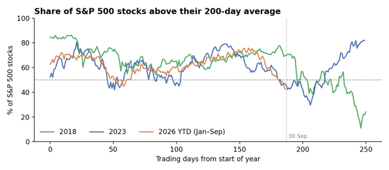
Small caps and the average stock have lagged the S&P 500 since early 2023 and now sit lower against it than at any point in 2023 or 2018; the equal-weight ratio is at its lowest since 2005. YTD small caps are slightly ahead of the index (up about 14% against 13%), unlike 2018 and 2023 when they trailed by 7 and 9 percentage points. But they gave back almost all of their relative YTD gains in the last three months, falling about 7% while the S&P 500 rose about 3%. The six-month decline narrowly misses statistical significance, so the reversal is recent rather than established.
5. Which groups are leading?
In 2023 the index return was effectively a Mag7 return, and every other group trailed. In 2018 the market fell, healthcare gained about 6% and the Mag7 was flat, while the other three groups fell. 2026 YTD has no single leader: all five groups trail the S&P 500. The YTD figures also hide big shifts within the year, and within the Mag7 the gap between the best and worst stocks is wide: Apple and Nvidia are each up about 23% YTD, while Tesla is down 21%.
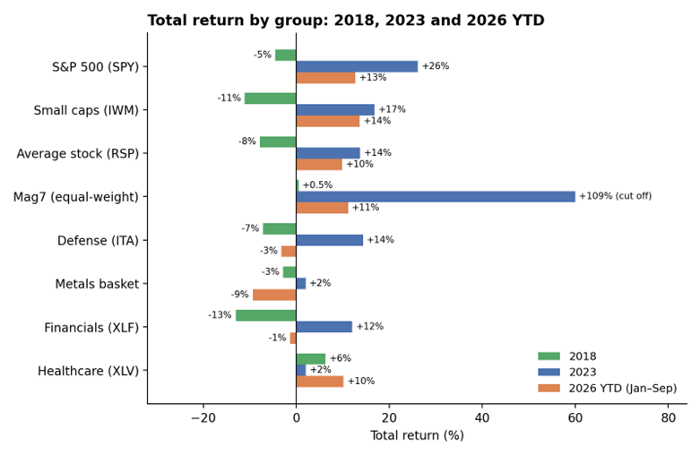
Mag7 is an equal-weight basket of Apple, Microsoft, Nvidia, Alphabet, Amazon, Meta and Tesla. Defense is ITA, financials XLF and healthcare XLV, and metals is a metals basket. 2018 and 2023 are full calendar years; 2026 runs from the last close of 2025 to 30 September 2026.
Mag7: No longer a dominant, unified trade. The equal-weight basket is up about 11% YTD against about 13% for the S&P 500, compared with a gain of 109% in 2023, when it beat the index by 83 points. Apple and Nvidia are well ahead YTD and Tesla is down by a fifth. The basket has been rebuilding leadership, however: over the last six months it returned about 31% against 21% for the index, and it was the only group ahead in September. In 2018 it led in the first half (up 18%), then was the hardest-hit group in the sell-off from late September to 24 December, falling about 26% against 19% for the S&P 500.
Defense: Trailed the S&P 500 in all three periods. It led in the first half of 2026 and peaked against the index in early March, and its price peaked in mid-August; since then it has fallen about 18%, and it is down 11% over the last month and 13% over the last three. It is down about 3% YTD against a 13% gain for the S&P 500.
Metals: The weakest of the five groups YTD, down about 9% against a 13% gain for the S&P 500, after a surge into late January, when gold and silver peaked. From that peak to a mid-July low the basket fell about 38%, and it ended September about 35% below the peak. It also trailed the index by a wide margin in 2023, but in 2018 it held up better than the market and gained about 5.5% in the fourth-quarter sell-off. Its volatility this year is about 44%, against 12% in 2018 and 16% in 2023.
Financials: Lagged in all three periods: XLF fell 13% in 2018 (against a 5% fall for the S&P 500) and rose 12% in 2023 (against 26%). It is down about 1% YTD. It rallied about 23% from a late-March low to an early-September high, then fell about 8% from that high by the end of September. A steeper curve usually helps bank margins, but it has not yet produced outperformance.
Healthcare: The biggest turnaround from 2023, from flat to a gain of about 10% YTD, the best risk-adjusted return of the five groups, with volatility only a little above the index's, though still about 3 points behind the S&P 500. It was also the best group in 2018, up about 6% against a 5% fall for the S&P 500, though it still fell about 15% in that year's fourth-quarter sell-off.
Do these groups benefit from inflation? Over roughly 14 to 22 years of history, none of the five reliably did better relative to the S&P 500 when inflation pricing was rising; no difference was statistically meaningful, and the Mag7 and metals both did worse in those months. The inflation argument for these groups is not supported by this data, so any case for them needs to rest on other factors.
6. Valuation multiples
Price data alone cannot show whether stocks are getting cheaper or more expensive relative to what they earn. This section uses the forward P/E ratio: the S&P 500's price divided by analysts' expected earnings for the next 12 months. A falling P/E can come from two very different sources, falling prices or rising earnings, and which one is at work matters for the comparison with 2018.
S&P 500 forward P/E ratio
Period | Start | Low or latest | Change | What drove it |
2018 | 18.6 (Jan) | 13.5 (Dec) | -27% | Prices fell while earnings estimates rose |
2026 YTD | 22.0 (Dec 2025) | 19.2 (Sep 2026) | -13% | Earnings estimates rose faster than prices |
Sources: FactSet Earnings Insight for all figures except the January 2018 start, which is from Yardeni Research (via Investing.com, 23 Jan 2018). The two providers differ slightly, so the 2018 change is approximate. The September 2026 figure is as of 24 September. 2023 ended the year at 19.5 (FactSet).
The decline has not been smooth: the multiple dropped to about 19.7 in the first quarter, rebounded to about 20.4 by the end of June, and slid again over the summer. It now sits slightly below its 5-year average of 19.8 and just above its 10-year average of 19.0, so the market is no longer expensive by recent standards. Apart from the first-quarter dip, it did not come from falling prices. The S&P 500 is up YTD, but expected earnings have grown faster, with analysts forecasting Q3 earnings growth of about 29% and most companies that give guidance guiding higher. Over the year as a whole, the market has become cheaper because earnings surged, not because prices fell.
2018 was different. Earnings were also at records, helped by tax cuts, but the S&P 500 fell nearly 20% between the end of September and its 24 December low while earnings estimates held up. The whole decline came from investors paying less for each dollar of earnings, in a year when the Fed was raising rates. In 2023 the multiple ended the year close to today's level, after yields had peaked and fallen.
The difference matters for reading the current setup. The lower multiple gives the market more cushion than a year ago, and strong earnings are doing the work that falling prices did in 2018. But record earnings did not stop multiples from falling in 2018, and may not now if long-term yields keep rising. With the real yield near 2.9%, the S&P 500 earnings yield of about 5.2% is only about 2.3 points above what inflation-protected Treasuries pay, which leaves less room for yields to rise without pressure on prices. The clearest warning would be the multiple falling because prices drop, rather than because earnings grow.
7. How close is the resemblance?
Side-by-side comparison. The similarity with 2023 is limited to the average stock lagging the index and to small caps and the equal-weight index sitting at historically weak levels against the S&P 500. Everything else is different or opposite: the direction of yields, the shape of the curve, commodities, the dollar, credit returns and, above all, the source of leadership.
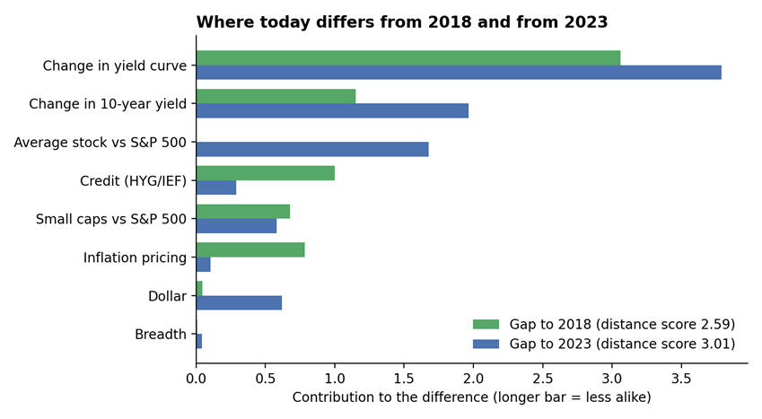
A closer statistical match. On eight standardized measures, comparing the trailing 12 months with the full years 2018 and 2023, 2018 (rising rates, strong dollar, late-year sell-off) is a closer match than 2023, with a distance score of 2.59 against 3.01. A ninth measure, the Mag7's performance against the average stock, is left out because it was built on an earlier Mag7 basket that was not truly equal-weight; with it, the scores were 2.59 and 4.07.
The chart shows why. Today matches 2018 closely on breadth, the average stock and the dollar. Almost half of the remaining gap to 2018 comes from the yield curve, which flattened in 2018 and is steepening now, followed by the size of the rise in the 10-year yield and credit, which weakened in 2018. The gap to 2023 comes from the same two rate measures, the yield curve (which became more inverted in 2023) and the 10-year yield, plus how much further the average stock lagged in 2023.
What followed similar conditions. Searching weekly data back to 2005 for dates with breadth and small-cap readings like today's finds 21 matches, all in late 2023 and spring 2025; none fall in 2018 or 2022, because small caps were not this weak relative to the index then. In every case the S&P 500 rose over the next 3, 6 and 12 months, and the Mag7 beat the index over 12 months each time, by a median of about 15 points. Metals beat it by more (about 31 points), defense beat it 19 times out of 21, and financials and healthcare lagged. But the matches come from only two episodes, both followed by strong rallies, so this carries little weight.
10. Conclusion
The four signals point the same way. The last few months look more like the second half of 2018 than like 2023.
- Yields: The 10-year is still rising, and the rise is driven by the real yield (about 2.9%), not by inflation expectations (2.36%). The causes are Fed hikes and heavy bond supply.
- Credit: High-yield spreads are still low by history but jumped from 2.73% to 3.08% in the last week of September.
- Valuations: The forward P/E has fallen YTD from 22.0 to about 19.2. That is because earnings are surging, not because prices have fallen. In 2018 the drop came from prices.
- Breadth: Only the mega-caps are holding the index up. The share of S&P 500 stocks above their 200-day average fell from 69% to 42% in September, and small caps trailed the S&P 500 by more than 9 percentage points in Q3.
In both 2018 and 2023, the market turned only after the 10-year yield peaked. That has not clearly happened yet, though a peak is only visible in hindsight. The two years also played out differently after their peaks. In 2023 stocks recovered within weeks. In 2018 they fell another 16% before the Fed signalled a pause.
So, the nearest indicators to watch are easing oil prices, since the oil shock is feeding into Fed expectations, and the Fed stopping its hikes. If both happen, a recovery like 2023's becomes possible. Until then, caution must be practiced.
You can also join our WhatsApp group for ongoing updates and direct access to our team.
2026 YTD (January to September) compared with 2018 and 2023
As of 30 September 2026.
Join the MyTimeEquity WhatsApp Group
This briefing is for informational purposes only and does not constitute investment advice. Data reflects publicly reported Q2 2026 earnings and market performance through June 2026.
Disclaimer: MyTimeEquity is a registered investment adviser. Information shared is for educational and informational purposes only and should not be construed as investment, legal, tax, or accounting advice, or as a recommendation to buy or sell any security. Views expressed are subject to change without notice.